Preparing a data analysis program for accelerometer data collected in people living with stroke my task is to analyse raw data collected from two wrist worn monitors, once on each arm. One of my collaborators was keen to replicate the 2D histogram methods in this paper:
Hayward, K. S., Eng, J. J., Boyd, L. A., Lakhani, B., Bernhardt, J., & Lang, C. E. (2016). Exploring the Role of Accelerometers in the Measurement of Real World Upper-Limb Use After Stroke. Brain Impairment, 17(1).
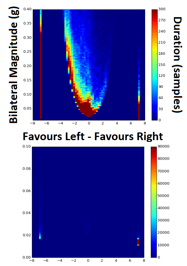
It seemed quite easy so I went ahead with it. However, I soon realised the problems with presenting data in this way when it is so heavily skewed. Take note of these two graphs, both of the exact same data with the only difference being the Z-axis colour bar scale and a zoom in on the Y-axis. By changing the Z-scale it makes the data look completely different, skewing in either direction depending on the settings. In the top graph it looks like vast majority of the time the person favours their left hand for movement, and that much of this occurs at bilateral magnitudes of greater than 0.05 g's. The bottom graph however shows the opposite, in that the majority of the time the person favours the right hand for movement and that almost none of the movements occur at greater than 0.05 g's. So which one is correct?
Hayward, K. S., Eng, J. J., Boyd, L. A., Lakhani, B., Bernhardt, J., & Lang, C. E. (2016). Exploring the Role of Accelerometers in the Measurement of Real World Upper-Limb Use After Stroke. Brain Impairment, 17(1).
It seemed quite easy so I went ahead with it. However, I soon realised the problems with presenting data in this way when it is so heavily skewed. Take note of these two graphs, both of the exact same data with the only difference being the Z-axis colour bar scale and a zoom in on the Y-axis. By changing the Z-scale it makes the data look completely different, skewing in either direction depending on the settings. In the top graph it looks like vast majority of the time the person favours their left hand for movement, and that much of this occurs at bilateral magnitudes of greater than 0.05 g's. The bottom graph however shows the opposite, in that the majority of the time the person favours the right hand for movement and that almost none of the movements occur at greater than 0.05 g's. So which one is correct?
Without the 1D histogram information provided for each of the Y- and X-scale variables I now realise that these intensity charts / heat maps / 2D histograms can be a trap. The image below shows the 2D histogram with the 1D histograms for each of the axes aligned with it. This helps to tell the tale more truthfully, but adds another layer of complexity with respect to interpretation.
These graphs looked simple at first glance, but as often happens with research this is not always the case. There is the potential to use a log transformed Z-scale to overcome some of this problem, but this adds in another issue in that changes in colour gradient will then be non-linear as well and therefore even more difficult to interpret.
These graphs looked simple at first glance, but as often happens with research this is not always the case. There is the potential to use a log transformed Z-scale to overcome some of this problem, but this adds in another issue in that changes in colour gradient will then be non-linear as well and therefore even more difficult to interpret.
